Home • Website UI/UX design • Kwik Kopy®
Kwik Kopy
For the Kwik Kopy® franchise website redesign, I focused on creating a modern, streamlined user experience that would improve navigation and enhance the overall journey for both franchisees and customers. The goal was to deliver a clean, intuitive platform that ensured seamless access to key services, including print ordering, file uploads, and service inquiries while reflecting Kwik Kopy®’s reputation for efficiency and reliability.
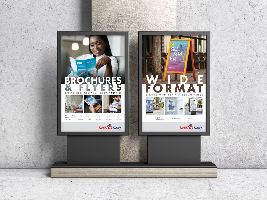
I developed detailed wireframes and high-fidelity mockups using Adobe XD to reimagine the site’s structure and visual design. Core brand elements, such as the iconic ‘running man’ logo and refreshed color schemes, were thoughtfully updated and optimized to create a cohesive, professional aesthetic suited for a contemporary digital space. Special attention was given to building a responsive design that provided a consistent and engaging experience across desktop, tablet, and mobile platforms, ensuring accessibility for all users.
Throughout the project, I collaborated closely with external web developers to ensure the final site preserved the integrity of the design while delivering a functional, polished product. By aligning usability, aesthetics, and functionality, the updated website successfully elevated Kwik Kopy®’s digital presence, providing a visually engaging and user-friendly platform.
This redesign was strategically implemented across all Kwik Kopy® franchise websites, ensuring a unified brand presentation and a seamless online experience for customers at every franchise location. The result is a platform that not only reinforces Kwik Kopy®’s professional identity but also empowers franchisees with a modern, efficient tool to meet the needs of their customer base.
This project reflects my ability to design and deliver high-quality digital solutions that combine brand consistency, technical precision, and user-centered design principles. By leveraging design tools like Adobe XD and collaborating effectively with development teams, I successfully transformed Kwik Kopy®’s online presence into a sleek, functional platform that aligns with the company’s strategic goals and enhances user engagement.
Visit the online home of Kwik Kopy® Columbia
Key highlights
Creative impact
Redesigned Kwik Kopy®’s website with a modern, streamlined aesthetic, updating core brand elements like the ‘running man’ logo and refreshed color schemes.
User focus
Developed intuitive wireframes and responsive designs to enhance navigation, improve usability, and ensure accessibility across desktop, tablet, and mobile platforms.
Strategic alignment
Implemented the redesign across all franchise websites, creating a unified brand presentation and empowering franchisees with a professional, efficient digital platform.
Related projects
Blending creative design with technical precision, my portfolio spans dynamic branding, technical graphics, proposal layouts, and marketing materials. Each project reflects a commitment to delivering clear, impactful communication. Explore my work to see how I bring complex concepts to life.
Portfolio
Quick Links
© 2024 – 2025 | keithrogersdesign.com. All rights reserved. Site designed and maintained by Keith Rogers.


