Kwik Kopy
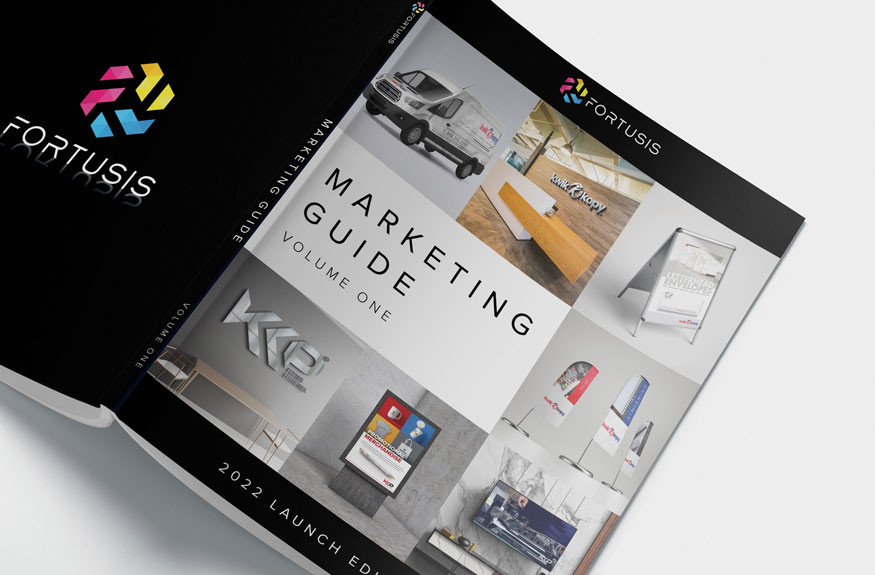
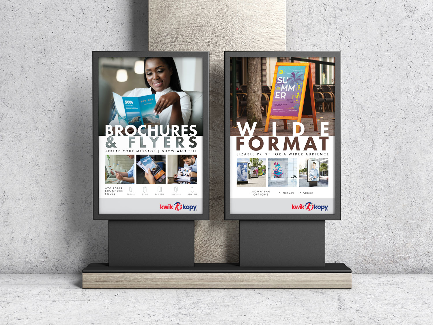
The branding for Kwik Kopy® encompassed a wide range of visual elements designed to establish and reinforce its identity. From posters, signage, and window perforations to vehicle graphics, stationery, postcards, tri-fold brochures, and banners, every piece was meticulously crafted to ensure consistency and impact. Each element was designed to communicate professionalism and align with Kwik Kopy’s commitment to quality, creating a cohesive brand presence across digital and physical platforms.
This comprehensive approach to branding ensured that all touchpoints—whether customer-facing or internal—reflected the company’s values and objectives. By leveraging a mix of bold visuals, clear messaging, and functional designs, the branding elevated Kwik Kopy’s market position and strengthened its connection with clients.
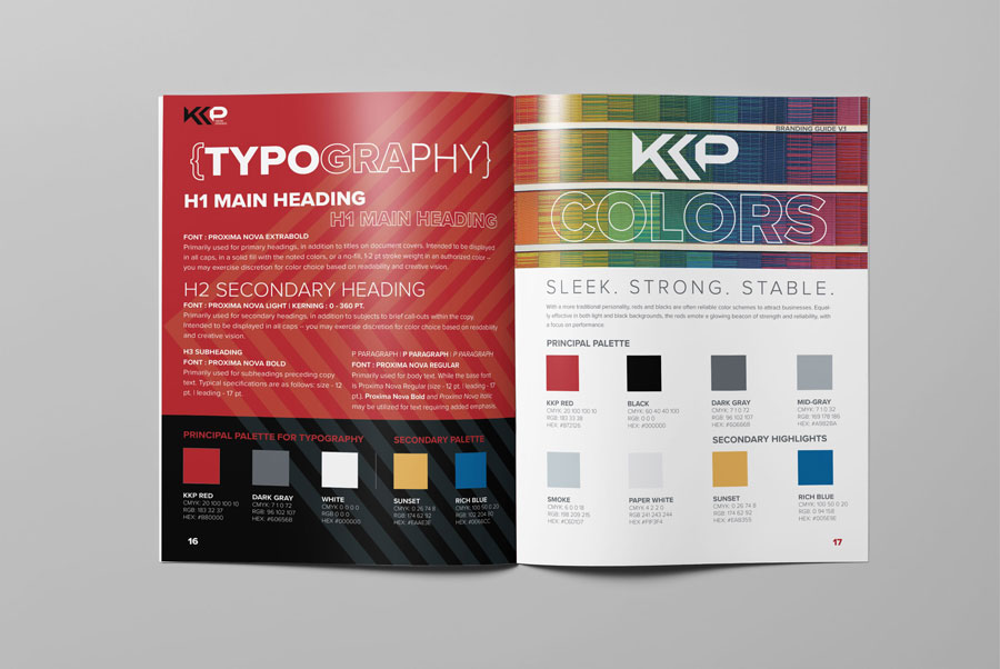
Central to the success of the Kwik Kopy® rebrand was the creation of a detailed branding guide developed in collaboration with corporate leadership. This guide was a strategic resource outlining the company’s visual identity standards, including logo usage, typography, color schemes, photography guidelines, and graphic styles.
I designed the guide’s layout, created all graphics, and authored the copy to ensure clarity and practicality. This comprehensive document empowered teams and franchisees to produce on-brand materials that adhered to the company’s aesthetic and messaging standards. The guide supported scalability and adaptability by establishing a unified visual identity, enabling Kwik Kopy® to maintain consistency and thrive in a competitive market.
The branding guide, which outlines how these standards came together to define and elevate the Kwik Kopy® brand, is available below.
Take a deep dive. Explore every detail.
Key highlights
Creative impact
The Kwik Kopy® Branding Guide standardized essential design elements, ensuring a cohesive and professional visual identity across all franchisee communications.
User empowerment
This guide provided franchisees with practical tools to maintain consistent branding, fostering trust, customer loyalty, and a unified customer experience.
Strategic alignment
Aligned with Kwik Kopy®’s core values and strategic goals, the guide strengthened brand integrity and positioned the company for long-term success in a competitive market.
Related projects
Blending creative design with technical precision, my portfolio spans dynamic branding, technical graphics, proposal layouts, and marketing materials. Each project reflects a commitment to delivering clear, impactful communication. Explore my work to see how I bring complex concepts to life.
Portfolio
Quick Links
© 2024 – 2025 | keithrogersdesign.com. All rights reserved. Site designed and maintained by Keith Rogers.


