home • layout design • KKP® Branding Guide
KKP® Branding Guide
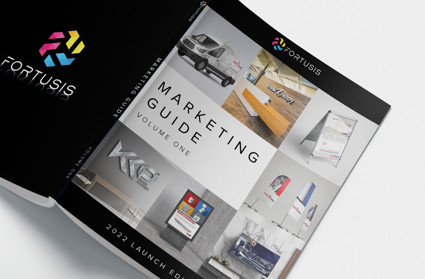
The KKP® Branding Guide was created to establish a cohesive and standardized approach to brand presentation for the commercial printing division. These comprehensive guidelines define and unify key elements such as brand positioning, voice, and tone, ensuring consistency across all communications and materials.
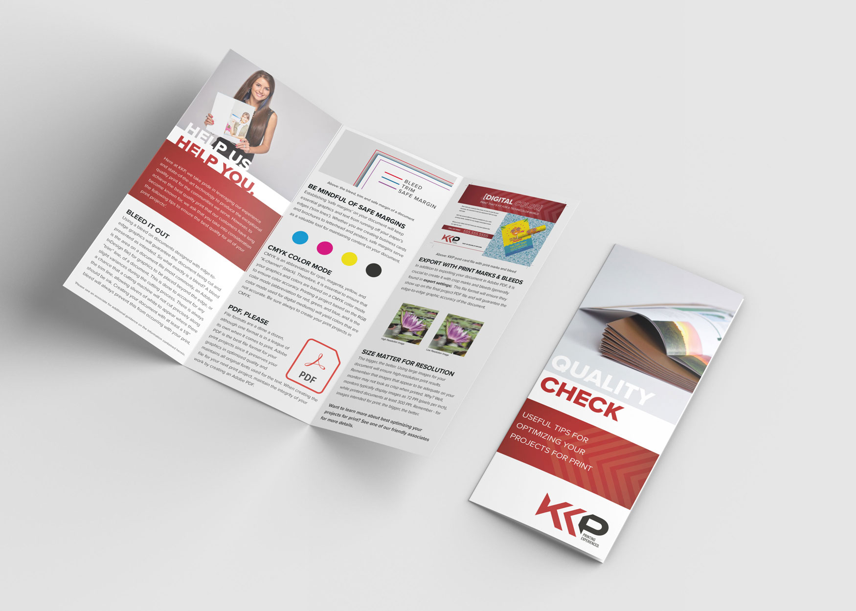
The guide includes detailed directives for logo design, typography, and color schemes, providing a clear framework for maintaining visual identity. It also outlines standards for photography style and the development of physical marketing assets, including brochures, business cards, and signage. This structured approach enhances brand recognition and ensures that every touchpoint consistently and professionally reflects the KKP® brand, reinforcing its market presence and supporting effective brand communication.
take a deep dive. explore every detail.
related projects
From detailed proposal layouts to large-scale catalogs and dynamic branding assets, I focus on blending creativity with functionality, ensuring each piece serves its purpose effectively. I invite you to explore my portfolio and discover the breadth of projects I’ve been proud to bring to life.
portfolio
quick links
© 2024 | keithrogersdesign.com. All rights reserved. Site designed and maintained by Keith Rogers.


