Home • Logo design • Kwik Kopy®
Kwik Kopy
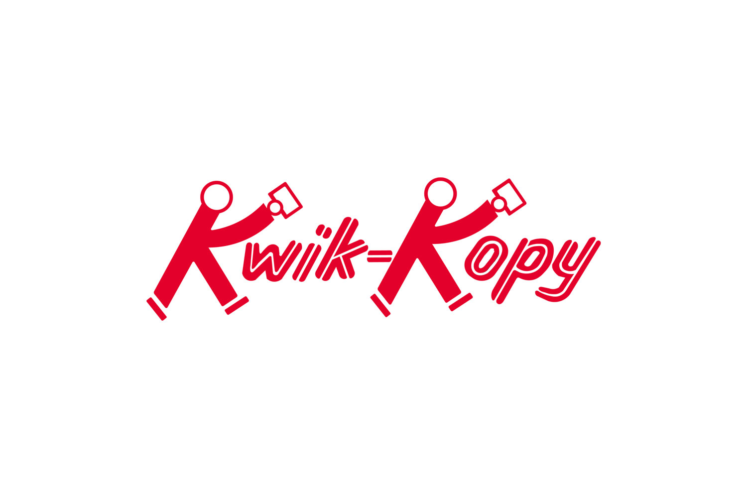
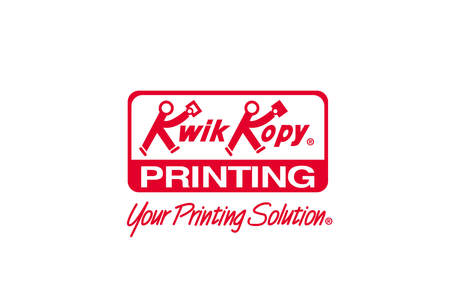
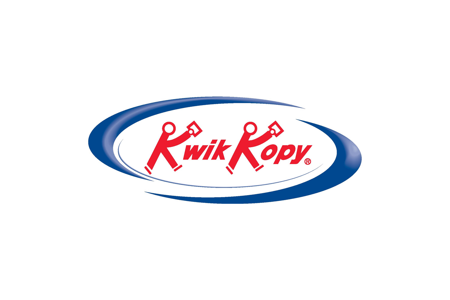
In Fall 2021, I led the comprehensive redesign of the Kwik Kopy® logo, a brand mark with a rich legacy dating back to its origins in 1967. While the logo had undergone previous updates—notably in the 1990s and 2000s—changing design trends and the growing need for digital scalability revealed the necessity for a modern refresh. My goal was to honor the logo’s historic identity while ensuring it met the demands of contemporary platforms and applications.
Initial logo proposal
The Kwik Kopy® logo redesign honored the brand’s heritage and recognizability while enhancing its visual appeal to align with contemporary design sensibilities. This process involved refining the shapes, simplifying unnecessary elements, and ensuring the logo was versatile and adaptable across diverse digital and physical mediums. The updated design preserves the essence of the Kwik Kopy® brand while meeting the aesthetic and functional demands of today’s competitive market.
Before becoming Marketing Director at Fortusis®, I initiated the redesign process by creating a detailed design brief that outlined early concepts for the next-generation Kwik Kopy® logo. The brief served as a foundation for the project, presenting an initial version of what would eventually become the finalized logo. It addressed a significant challenge: fragmented and inconsistent branding across the franchise network, which diluted the company’s visual identity and market cohesion.
The proposed strategy laid out a straightforward, step-by-step approach to unifying the brand’s visual identity, ensuring consistency and professionalism across all platforms—whether in print, on signage, or within digital environments. The design brief emphasized the importance of retaining brand familiarity while introducing modern refinements to create a logo that would resonate with longstanding customers and appeal to new audiences.
By balancing timeless design principles with contemporary functionality, the redesigned logo successfully positions Kwik Kopy® as a forward-thinking, reliable leader in the commercial print industry. This project demonstrates my ability to analyze branding challenges, develop strategic solutions, and deliver visually impactful designs that serve modern audiences’ practical needs and aesthetic expectations.
You can view the proposed logo redesign below.
Refinement & release
The Kwik Kopy® Mk III logo officially debuted at the franchisee conference in May 2022 following a focused design refinement process. It was publicly announced through a press release in Printing Impressions on June 27, 2022. This updated logo represents a modern evolution of the brand’s identity, offering a refreshed, contemporary look that retains its iconic elements while meeting the scalability and versatility requirements of today’s digital-first market.
The Mk III logo was strategically designed to ensure seamless application across digital and physical platforms, maintaining its visual integrity and impact at any size. Its thoughtful refinements positioned the emblem as a timeless yet forward-thinking representation of the Kwik Kopy® brand.
Following its debut, the new logo was rapidly adopted across the franchise network, serving as the visual cornerstone of the company’s identity. It was implemented across websites, marketing collateral, storefronts, signage, and a wide range of branded materials, unifying the brand’s visual presence and reinforcing its professional, consistent image.
This successful rollout highlights my ability to lead comprehensive branding initiatives that deliver modern, high-quality visual solutions while maintaining brand heritage. By balancing creative design with practical implementation, the Mk III logo ensures Kwik Kopy® remains visually relevant, recognizable, and adaptable in an evolving marketplace.
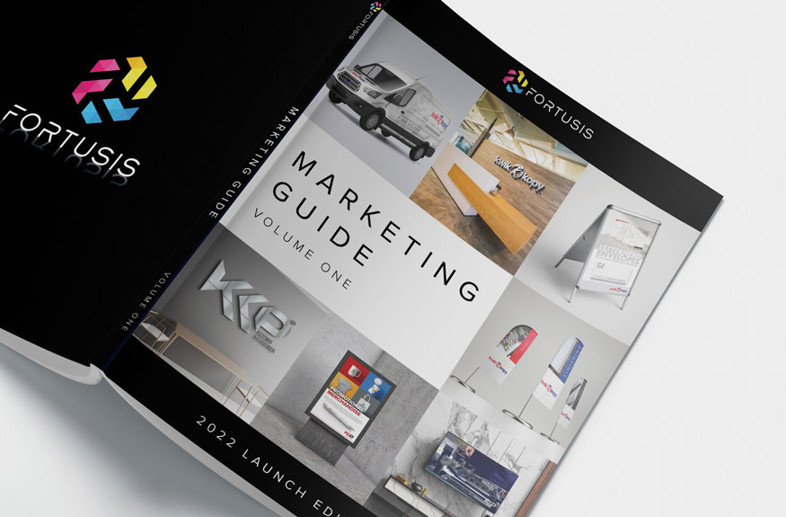
The Kwik Kopy® Branding Guide provides further insights into the redesigned logo and its applications across various platforms. It outlines the key design principles and color palettes that ensure consistency and professionalism. This guide demonstrates how the refreshed identity balances the brand’s heritage with a modern, adaptable approach to branding. Explore the details below in the interactive flip book.
Take a deep dive. Explore every detail.
Key highlights
Creative impact
Redesigned the Kwik Kopy® logo to honor its legacy while introducing modern refinements for visual appeal, versatility, and digital scalability.
Strategic alignment
Developed a unified branding strategy to address fragmented franchise visuals, ensuring consistency across digital, print, and signage platforms.
Impactful rollout
Launched the Mk III logo at the 2022 franchisee conference, rapidly adopted across the network, reinforcing Kwik Kopy®’s professional and cohesive identity.
Related projects
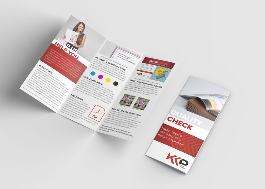
Blending creative design with technical precision, my portfolio spans dynamic branding, technical graphics, proposal layouts, and marketing materials. Each project reflects a commitment to delivering clear, impactful communication. Explore my work to see how I bring complex concepts to life.
Portfolio
Quick Links
© 2024 – 2025 | keithrogersdesign.com. All rights reserved. Site designed and maintained by Keith Rogers.
