Home • Website UI/UX design • KKP®
KKP
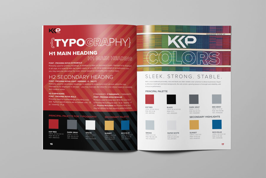
When tasked with creating the first website UI design for KKP®, the commercial B2B print division of Kwik Kopy®, I leveraged the established KKP® branding guidelines to ensure a consistent, professional, and recognizable online presence. These guidelines—including color schemes, typography, logo placement, and other critical brand elements—formed the site’s visual identity foundation, ensuring alignment with KKP®’s trusted image in the commercial printing industry.
The primary objective was to design a user-friendly, intuitive experience that effectively catered to the needs of B2B customers, enabling them to easily explore and engage with KKP®’s diverse commercial printing services. I developed detailed wireframes and interactive mockups using Adobe XD that outlined the site’s layout, navigation structure, and interactive elements. These prototypes provided a clear visual blueprint, ensuring the design prioritized clarity, ease of navigation, and accessibility—essential for driving engagement and meeting customer expectations.
Once the design phase was complete, I collaborated closely with an external web development team, who brought my prototypes to life. This collaborative effort ensured that the final product preserved the integrity of the original design while delivering a functional, visually appealing, and responsive website. To maintain brand consistency and provide a cohesive experience for KKP®’s customers, the site design was implemented across franchise websites, creating a unified digital presence for all franchise owners.
This project highlights my ability to translate brand guidelines into dynamic, high-quality digital solutions while balancing aesthetic appeal with usability. It also reflects my proficiency in design tools like Adobe XD, my ability to collaborate effectively with developers and stakeholders, and my strategic focus on enhancing the user experience for targeted audiences. By delivering a polished, consistent, and scalable website design, I helped strengthen KKP®’s online presence, supporting their broader marketing and operational goals in the competitive B2B print market.
Visit the online home of KKP Houston
Key highlights
Creative impact
Designed a polished and professional website UI using KKP® branding guidelines to ensure consistency and alignment with the company’s trusted image in the commercial printing industry.
User focus
Developed wireframes and interactive mockups in Adobe XD to create a user-friendly, intuitive experience tailored to B2B customers’ needs.
Strategic collaboration
Partnered with an external development team to implement a responsive, scalable design across franchise websites, strengthening KKP®'s unified digital presence.
Related projects
Blending creative design with technical precision, my portfolio spans dynamic branding, technical graphics, proposal layouts, and marketing materials. Each project reflects a commitment to delivering clear, impactful communication. Explore my work to see how I bring complex concepts to life.
Portfolio
Quick Links
© 2024 – 2025 | keithrogersdesign.com. All rights reserved. Site designed and maintained by Keith Rogers.


